In March of 1969, Ballantine Books decided to take advantage of the success of Stanley Kubrick's film 2001: A Space Odyssey by re-releasing five of their Arthur C. Clarke paperback backlist titles with matching trade design. Each features artwork clearly inspired by the film (while Ballantine had published numerous books by Clarke, Signet Books had the rights to the novel 2001: A Space Odyssey and other books related to the film, one of which (The Lost Worlds of 2001) I discussed in a previous blog entry).

Several years ago, after reading Clarke's novel version of 2001: A Space Odyssey (which I not only greatly enjoyed, but which led me to appreciate the film beyond its amazing audio/visual spectacle), I decided to seek out other works by the author.
I'm not sure which of these five titles I ran across first, but as soon as I saw the ship designs so clearly inspired by the film, I decided I'd have to track them all down. Fortunately, the back of each book shows the covers of the other four titles in the series, making it was easy to know what to look for. While none are particularly rare in these editions, paperback collectors will appreciate the desire to have a matching set of books like these.
Sadly, the cover artist responsible for these renditions is not credited in the books. If you stumble across this blog entry and happen to know the artist responsible, please leave a comment and I will gladly update this entry. For now, here are the details and a larger version of each of the five books in the series.
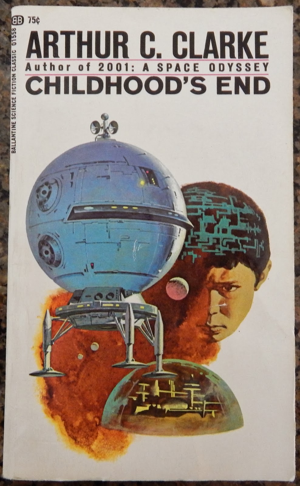
Childhood's End
Ballantine 345-01558 75¢
Tenth Printing, March 1969
Expedition to Earth (short stories)
Ballantine 345-01559 75¢
Fourth Printing, March 1969

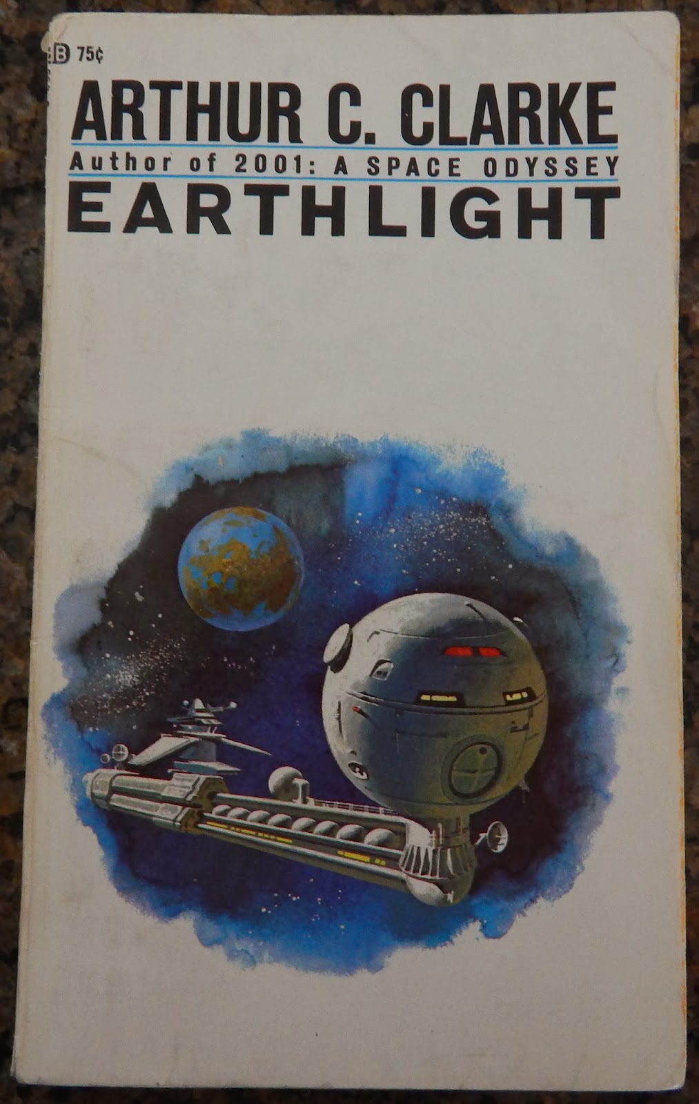
Earthlight
Ballantine 345-01560 75¢
Fifth Printing, March 1969
Reach for Tomorrow (short stories)
Ballantine 345-01561 75¢
Fourth Printing, March 1969

Tales from the White Hart (short stories)
Ballantine 345-01562 75¢
Fourth Printing, March 1969

6 comments:
These editions are the ones I always enjoyed. EARTHLIGHT was the first I purchased. However, when I got around to the others, the covers had been changed. It wasn't until the 1980's that I was able obtain the others. The artist did a OK job with Childhood's End, Earthlight, Expedition To Earth. The leanage of the vessels to the Discovery One was clear and well depicted. However Reach For Tomorrow failed -- the ship depicted bore almost no resemblance to 2001's technology. All it had was the three-dish antenna array from Discovery. As for Tales From The White Hart, there was absolutly nothing at all that could link it to 2001. The artwork being by the same artist was all there was. I really wish they would get it into their heads to re-do the covers to reflect 2001; the film has never been dated.
I suspect that Dean Ellis was the artist for these covers.
Ellis painted many covers for Ballantine in the '60s and '70s, in a style very similar to the one shown here. If you look, for example, at the covers he provided for the James White "Sector General" series, you can see a strong resemblance in some of the detailing on the ships.
In the early 1970s, Ellis painted a new series of covers for these Arthur C. Clarke reprints, but these relied less upon imagery based on 2001: A SPACE ODYSSEY, and more upon his own imagination.
I think these covers have become memorable because they did seem to fit that "2001" universe. I tend to doubt that these covers were done by Dean Ellis. While he has made ships that are definitely inspired by the look of Discovery, he seems more attuned to creating spaceships for cover art than this series of Ballantine covers would suggest. His published work around that time would argue against his creating what are in several cases rather haphazard designs.
While executed professionally, the designs of the ships represent a series of kitbashed elements, taking elements from ships shown in 2001 and re-interpreting or inserting them into a finalized design with less care for how the parts fit or work together.
Perhaps these were done by a professional illustrator, but one not as well practiced at SF illustration, or spaceships in particular based on availability. It would make sense as it appears this series was released quickly to take advantage of interest in Clarke's work as a result of the previous year's release of 2001. Stylistically I wouldn't say these clearly fit with any other Ballantine cover for 1969 as shown at the ISFDB (http://www.isfdb.org/cgi-bin/publisheryear.cgi?19+1969+1)
Dean Ellis ... You're absolutely right!!
As an interesting follow up on my earlier comment, and Hamhock's comment, I did find the real life reference for the cover of Tales From the White Heart, and by extension the squarish antenna array featured there and some of the other covers, such as Earthlight. That is the space station featured in the 1964 New York World's Fair Futurama Exhibit. Now this may be the result of the artist either having personal exposure to it (NYC is where BB is headquartered), or perhaps from a feature in a magazine. The Atlantic's website has a photo of it in almost exactly that angle. You can find a Flickr image here (https://www.flickr.com/photos/glenhsparky/4522955862/in/album-72157623615685632/)
It does reinforce the idea that this illustrator did in fact use existing SF-imagery to compose these covers as a sort of kit bash in much the way SF-spaceship props are modeled.
I'm inclined to agree with the poster who argued for Dean Ellis. He painted the 1970 re-issues of James White's novels. The similarities in style between the White covers and the Clarke covers are hard to miss.The colour palettes are much the same as well.
Post a Comment