The Critical Guide to
the Warren Illustrated Magazines
1964-1983
by Uncle Jack
& Cousin Peter
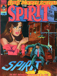 |
| Eisner |
"The Inheritance" (4/11/48)
Story by Will Eisner
Art by Will Eisner & Jerry Grandenetti
"The Moment of Glory" (7/2/50)
Story and Art by Will Eisner
"Olga Bustle in 'Outcast'" (9/1/46)
Story by Will Eisner
Art by John Spranger, Will Eisner, & Bob Palmer
"The Fix" (5/4/47)
Story by Will Eisner
Art by Will Eisner & Jerry Grandenetti
"The Fly" (3/10/46)
"Who Killed Cox Robin?" (8/4/46)
Story by Will Eisner
Art by John Spranger, Will Eisner, & Bob Palmer
"The Springtime of Dolan" (7/11/48)
Story by Will Eisner
Art by Will Eisner & Andre LeBlanc
"Dulcet Tone" (7/7/46)
Story by Will Eisner
Art by John Spranger, Will Eisner, & Bob Palmer
Jack-This last issue is a mixed bag of post-war stories. There's a quartet from 1946, with pencils by John Spranger and inks by Eisner and Bob Palmer. The best of these is "Olga Bustle," a spoof of Jane Russell that features a noticeably different art style, more early 1940s broad lines and cartoony looks than the late 1940s look of subsequent Spirit strips. "Who Killed Cox Robin?" has a terrific sixth page that looks very noirish. There are a couple of stories from 1947-48 inked by Eisner and Grandenetti; "The Inheritance" leads off the issue and is a perfect mix of crime and humor as the Spirit once again manages to elude marriage-minded Ellen. There's 1948's "The Springtime of Dolan," inked by Eisner and LeBlanc, which starts out great but loses focus midway through and, last of all, from 1950, we have "The Moment of Glory," in which Eisner mixes ghostly doings, crime, and humor with the focus being on a little guy's heroic act.
I'll admit it, Will Eisner is one of my comic book heroes--I view him and Carl Barks as the two greatest all-around talents in comics history. But what re-reading these 16 issues of Warren's The Spirit has taught me is that, even after he came back from the war, he wasn't doing it alone--despite the lack of credits given to anyone else in the strip's initial run. Grandenetti, Feiffer, LeBlanc--they all contributed to this fantastic strip, and I'm indebted to the comics historians who have unearthed their hidden contributions.
Peter-The thing I'll miss most about The Spirit, as we salute the 16th and final issue of the Warren incarnation, even more than the hit-or-miss humor and the weird supporting characters, will be those gorgeous splashes. Even if the story is a snooze, chances are Eisner's art will carry the day and that begins with his trademarked splash, usually incorporating "The Spirit" in some strange landscape or architecture. Jim Warren has said he would have loved to continue publishing the Spirit's adventures, but the magazine couldn't move enough copies to keep it going.
After the axe fell at Warren, Eisner returned his character to Kitchen Sink (which had published two issues of reprints just prior to Warren's version), continuing the numbering at #17. That version resembled Warren's, magazine-sized and black-and-white (with color added later) and lasted 25 issues, until 1983. The Spirit then was reincarnated as a comic-sized zine, also published by KS, for 87 issues, until 1992. Perhaps the most lavish version was DC's complete reprinting (in order), The Spirit Archives. If you're serious about The Spirit, that's the way to go.
"The Resurrection of Papa Voudou!"
(Reprinted from Vampirella #15, January 1972)
"...And Be a Bride of Chaos"
(Reprinted from Vampirella #16, April 1972)
"The Corpse with the Missing Mind" ★★1/2
Story by Bill DuBay
Art by Jose Gonzalez
"The Lurker in the Deep!"
(Reprinted from Vampirella #13, September 1971)
As is her custom, Vampi always likes to tell one original story to round out the reprints in her annual "Super Collector's Edition!" The retreads are highlighted by the superior "Papa Voudou," one of the best installments of the decidedly lukewarm Vampi series ever written. The other two aren't bad either.
In the new Vampirella adventure, "The Corpse with a Missing Mind," Vampi joins Pen in attending the funeral of Henderson Hunt, an old friend of Pen's, a billionaire he'd fallen out of contact with. After the service, the pair are approached by another of Pen's old friends, Charlie Juggles, who tells an odd story to the magician. The trio pack into a limo and are driven away. According to Juggles, Hunt's brain and eyeballs were stolen while the pair were flying in Hunt's private jet. Juggles believes that Hunt is still alive somewhere. Suddenly, gas fills the backseat of the limo and the three passengers lose consciousness.
When Vampi and Pen awaken, Juggles is nowhere to be found, but the pair are soon confronted by strange characters such as the Seven Dwarves, pirates, and space heroes. Vampi wonders aloud if they've fallen into Alice's Wonderland and Pen suddenly exclaims "I've got it!" They are in Wonderland... or at least a theme park variation on Wonderland. The voice of Henderson Hunt emerges from the shadows, confirming Pen's suspicions.
Vampi and Pen enter a laboratory and there, sitting upright in a chair, is the body of Hunt; in a tank beside him float his missing brain and eyeballs. The billionaire has devised a way to live forever but wants to atone for the waste he feels his life became after he inherited his riches. He will build Wonderlands all over the world with free admission and children will come and play and smile. He admits to his friend Pen that it will be the first time in his life that he will be truly happy.
For a Pen/Vampi solo short that doesn't seem to fit anywhere in the current chronology (what else is new?), "The Corpse with a Missing Mind" is not bad; it is, in fact, better than any of the Vampi stories we've been fed lately. It's goofy and derivative and doesn't make a lot of sense (so why the elaborate ruse, gassing his buddy, when he was going to tell him the truth anyway?) but it's a pleasant five-minute read. Sharp color, too, due, according to the credits to Bill DuBay.-Peter
Jack-I'm surprised you liked that mess by DuBay. I thought the story and color were terrible, and the art by Gonzalez made me wonder just what happened between 1972 and 1976. When we first reviewed "Papa Voudou," I wrote that it was entertaining from start to finish and had gorgeous art. I wasn't as impressed by "Bride of Chaos," which I found unsatisfying, but I called "Lurker" thoroughly enjoyable, well-told and with great art. The cover, by Sanjulian, is reprinted from Vampirella 36--or at least the illo is.
"The Strange, Incurable Hauntings of
Terrible Phinneas Boggs" ★★★
Story by Bill DuBay
Art by John Severin
"Process of Elimination" ★★
Story by Bruce Jones
Art by Russ Heath
"Country Pie" ★★1/2
Story by Bruce Jones
Art by Carmine Infantino & Bernie Wrightson
"In Deep" ★★★
Story by Bruce Jones
Art by Richard Corben
"Harvey Was a Sharp Cookie" ★
Story by Bill DuBay
Art by Jose Ortiz
"Now You See It..." ★★★
Story by Bruce Jones
Art by Al Williamson
"The Last Super Hero" ★★★
Story by Cary Bates
Art by Carmine Infantino
A novelist buys the mansion that once belonged to a famous movie star/stunt double and discovers that the actor's ghost still haunts the hallways, craving attention. A nice change of pace, devoid of any real violence or fatalities, "The Strange, Incurable Blah Blah Blah..." had me smiling through most of its text-dense and typo-riddled length. It's the kind of thing that might have been dramatized on Night Gallery, a wink at the viewer and reassurance that there won't be any real scares tonight, but you'll be entertained, nonetheless. My only nit is that the writer doesn't come off as a contemporary scribe, using an almost stilted form of prose, a la Poe or Lovecraft. There are no African Americans to insult here, so Dube throws in a random "faggish" when describing one of Phineas's more "feminine" guises. Severin's art is, obviously, a gigantic portion of my affection for this one.
Chris heads home from his "government job" and puts bullets in his wife and two kids, then meets up with his secretary, Madge, for a fling at a motel. Once the lovemaking is over, the two park on a viewpoint overlooking the town. Chris kills Madge and then settles in for the main event: a nuclear holocaust.
I vividly remember reading "Process of Elimination" for the first time as a teen and being (pardon the pun) blown away by its hazy conclusion. What kind of job was Chris doing that he knew the precise time of "the end of the world"? Why was using a handgun (with silencer!) more virtuous and merciful than sleeping pills? And, more important, did Chris know he was married to Florence Henderson? My teen mind whirled around the savagery and really deep thinky stuff.
Now, having read the story for a third (or possibly fourth) time, I have to say the element that shows through strongest is pretension. We're supposed to hate Chris (I assume), since he's selfish enough to off his family so that he can die in the arms of his deflowered lover, so why is Jones painting the guy as a wonderful family man doing the right thing? Maybe that's not Bruce's intent, but that's the vibe I get. Russ Heath's art is awful, a mere shadow of what the man was capable of in his younger years. Those panels of Gwyn dishing out some pie and taking some lead between her breasts are cringe-worthy (if I saw those panels reprinted somewhere sans credit, I'd guess Dick Ayers). A big, big disappointment and, I have to believe, one of Warren's more controversial, divisive tales.
Things are a little more clear in Bruce Jones's next story, "Country Pie." A psychic helps police track a serial killer who's about to score his (her?) next victim. Meanwhile, a slick city man stops on a country road to give a lift to a pretty young teenage girl and her little brother. Will the police arrive in time to prevent the murderer from striking again? Thankfully, Bruce disposes of the "mystery" of the killer's identity halfway through the story (it's fairly evident who the fiend is), so there's no foolish "Aha!!!" in the final panel. But what does arrive in the climax is a bit abrupt and disappointing. It's still an entertaining read, and Bernie and Carmine make a decent art team, with Bernie being more evident in the last couple pages.
While far out at sea, a young couple find themselves in deep trouble when their small sailboat sinks and the pair are left to drift, clinging to a life preserver. Though they fight to stay awake, both drift into slumber and, when he awakens, the man finds his wife dead. From there, it's only a matter of time before the gulls and sharks begin to pick at her corpse. After several days, a freighter comes along and picks the man up. In the hospital, doctors are able to pry the man's hands apart and discover he's holding a human heart.
Looking back now, I think "In Deep" was the first time I became aware of this new kid on the block, Bruce Jones. I won't lie and say that I was keeping track of the writers of these things, not back then, but I do recall being very impressed with a few stories that carried his name and then looking forward to reading anything he pumped out. That extended into the 80s, when Jones reinvented the horror anthology funny book with Twisted Tales.
It's obvious Jones took his inspiration from Jaws, which had shattered box office records the summer before, but the story doesn't rely entirely on the attack of a Great White. There's a lot of stuff going on here. Some of it I ain't buyin' (like how our hero ended up with Peggy's heart and why the sharks didn't come back for some live meat), but that won't spoil a tale so filled with suspense that the reader is literally on the edge of their seat. Though I'm sure the black-and-white prologue and epilogue in the hospital were a necessity due to Jim Warren's cheapness, I would argue that the colorless bookends are actually pretty effective as is. Oddly enough, when "In Deep" was reprinted in Creepy #101, it was presented in all B+W (even weirder, when "In Deep" was reprinted in Comix International #5, the story was printed sans prologue and the epilogue was printed on the back page in red ink! See far below), and was followed up by a needless and silly sequel that same issue.
 |
| Then some idiot turned out the lights! |
The umpteenth "homage" to "Blind Alleys," Bill DuBay's "Harvey Was a Sharp Cookie" is a chore from the first panel to the last. Dube's not even trying here; the goal is to pump this thing out as fast as possible with as little effort as he can muster. Apply several layers of sadism and the kids'll love it, right? Harvey's the prototypical good guy pushed too far, but the extremes he goes to stretch the boundaries of believability. How could Harvey guess that the bad guy was going to walk into his hall of mirrors and smash the glass with his bare hands? Bit of a stretch. Wouldn't it just be easier to blow the guy away with a shotgun? But that one-star rating extends to the art as well, which is about as muddy and indecipherable as Ortiz has ever been. There's a muddiness to it that resembles a fifth-generation VHS-tape.
Poor Harry only wants to spice up his dull marriage, so he continually sets the Selector-Hologram remote control to remote planets and dangerous creatures, all the better to play hero in front of his bored wife. All that Della wants to do is watch Al Pacino movies; that takes her mind off the fact that her husband spent all their savings on the silly hologram gizmo. But then Harry plays a trick on the Mrs., taking her to a prehistoric planet and confessing that he drugged her and motored the family spaceship to a distant star. Unfortunately, the ship crashed and they're stuck; might as well make the best of it.
After Harry's sexual moves on Della go nowhere and he tires of her endless whining ("You're a child, Harry... a thirty-year-old drop-out from a Burroughs novel!"), he hits a button on the remote and they're both back in their home. Harry admits it was all a trick to get Della involved. Amazingly enough, the machination pays off for the King of the Nerds as Della admits she kinda felt a little naughty in front of a fire in a cave without much on and she grabs the remote, setting the dial for "Killer T-Rex!"
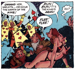
"Now You See It..." is a lot of fun; you can tell Bruce was raised on some good ol' EC science fiction. It's got a very familiar flavor, and that could be due chiefly to the art of Al Williamson, who should be the perfect choice for a sit-com about a guy who likes to dress his wife in leopard skin onesies and threaten her with giant lizards. Alas, this isn't the Williamson we saw in the EC days, but a shell of his former self. True, some of his art is still pretty cool (that giant insect-dinosaur-monster reprinted above), but a lot of the panels just lie there with no energy to speak of. Still, this is a hugely entertaining sf-comedy.
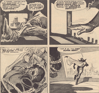
In a future where war no longer exists, superheroes have hung up their capes and masks and blended in with the general public but, when he perceives an invasion of militant forces, the hero known as Furyfists laces them up and heads back into action. The enemy is ready, though, and Furyfists is killed in action. Meanwhile, another hero sees the news on TV and decides he's Earth's only hope.
I liked "The Last Super Hero" a lot but I won't lie; I can't say I fully understood the climax. That might be due to my density or because some info got left out of the little caption boxes. Is the "secret invasion" all in Furyfists's head? Who is the new last super hero in the final panels and why is there a beat-up corpse tied to a chair in the hero's HQ? It's all a bit hazy. Regardless of the ambiguity, I thought the script was strong and exciting and Carmine's pencils (and inks--the only Warren story he flies solo on) only add to that excitement. On his excellent Warren blog, our good friend and correspondent, Quiddity, questions "why this completely non-horror story appears here in Creepy."
It is very unique but also in keeping with some of the other unique trails the Warren writers have explored now and then (such as the goofy "Super-Abnormal Phenomena Survival Kit" back in #79). And thank God for the variety, a rest from the crap DuBay and Boudreau were (sump)pumping out of their Warren offices. And that finale (even as hazy as it is) is pretty horrific, wouldn't you say? As for Carmine, who begins a long (and some would say fruitful) partnership with the Warren zines this month, I'm on record as saying I dig his stuff. Always have. One of the only Silver Age DC artists I can stomach. So, I'm really looking forward to some of the bizarre matchups coming down the pike: Carmine with Alex Toth, Alfredo Alcala, Dick Giordano, and several others.-Peter
Jack-I was pleasantly surprised (all right, shocked) to read such a good issue of Creepy at this point in our journey! Gathering together John Severin, Russ Heath, Bernie Wrightson, Richard Corben, and Al Williamson in one mag, with seven new stories, was an embarrassment of riches. Sure, the DuBay prose drags things down a bit and the Ortiz art is muddy as heck, but this issue stands out among the junk we've been reading for far too long.
I thought "In Deep" was terrific, in part because Corben is such a better colorist than DuBay. This is a good example of what a Creepy story should be. Next best was "Country Pie," which had some surprises along the way and in which Wrightson's inks took some of the scratchiness off of Infantino's pencils. "Now You See It..." has some bad, DuBayish dialogue (from Bruce Jones, of all people), but the Williamson art is wonderful to see. DuBay's endless narrative captions drag down "Phineas Boggs," in spite of the usual solid art from John Severin; someone should have told DuBay that a good comic book story is one where the words and pictures depend on each other. This could be read without pictures and nothing would be lost.
I thought Heath's art on "Process" was not that bad, Peter; I was grateful he did not depict the murders of the children and the wife's body only exists in comics drawn for young guys. "Harvey" surely was written thinking of Palisades Amusement Park, which closed in September 1971 and was replaced by high-rise condos. The "Blind Alley" rip-off is inexcusable. And Quiddity is right about "Super Hero"--why is this here? The Frazetta cover is nothing special, but the Brancatelli column offers a fascinating look at the comic book distribution system.
"The Death of a Friend!"
(Reprinted from Eerie #49, July 1973)
"The Mind Within"
(Reprinted from Eerie #50, August 1973)
"Ghoulish Encounter"
(Reprinted from Eerie #52, November 1973)
"Enter Mr. Hyde"
(Reprinted from Eerie #53, January 1974)
"Stranger in a Village of the Insane!"
(Reprinted from Eerie #54, February 1974)
"...And An End!"
(Reprinted from Eerie #48, June 1973)
"The Hope of the Future"
(Reprinted from Creepy #57, November 1973)
Peter-Well, I guess it could be worse: an all-Oogie issue? Though I savaged Steve Skeates's epic of lunacy when we first reviewed it, I must add that the man himself seemed to be in on the joke the entire way. Way back in, I think, the early '00s, I wrote a piece on this series for a Warren fanzine (the name of which is honestly lost in my brain), extolling the virtues of flying by the seat of your pants when you write for a Warren funny book. I was generally positive in a snarky way and Steve Skeates got my e-mail address from someone and wrote me a long essay on how many roadblocks and landmines came with overseeing the Mummy and (later) the Werewolf series. A lot of writers would have bitched about how much work goes into their craft and how dare a nobody like me make fun of their children. Not Steve. He agreed with several of my points and countered several more. I exited that exchange with a mountain of respect for this guy. But the Mummy is just as dopey and indecipherable on a third reading as it was on the first.
Jack-It says a lot that Warren reprinted the stories out of order. They made little sense to begin with, so why not put the first story in the series last in this issue? The GCD tells us that some of the stories have pages deleted and other pages reordered. I did not read the whole thing over again to see if it makes any more sense--I'm not that dedicated. Still, in looking back over my initial comments on these tales, I always liked Brocal's art. So at least we have that. Oh, and the usual terrific inside cover by Wrightson.
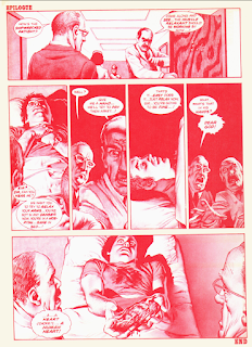 |
| "In Deep" gets the special Warren treatment in CI5 |
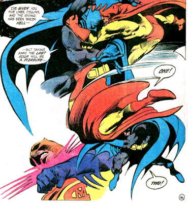 |
| Next Week... CatMan is Back! But is that a good thing? |








8 comments:
A pretty good new Vampi story this time; I think restricting it to 8 pages as was needed to make it color helps a lot (granted that didn't help the horribly written color story in last year's all reprint issue). Keeps the writer moving things along at a good pace, as the Vampi stories from this era seem to get longer and longer, with the quality going down further and further. Also nice to see Jose Gonzalez art as Gonzalo Mayo has been doing most of her stories lately. My recollection is that Gonzalez will be back to doing most of her stories for a while. I think this is also the final time we get new color Vampi material in the annual reprint issue.
Awesome issue of Creepy, one of the best we've had in a while (at least since issue 75, although I thought 79 was also fairly strong). Severin's story to start off the issue is a bit overwritten for me, I guess it comes with the territory for a Bill Dubay authored story, but it is a nice change of pace to how violent Dubay's work is from this era. I remember not being too happy with Heath's art either the first time I read "Process of Elimination", although I'm pretty sure this was my first Warren story of his and I grew to love his art a lot from reading other stuff we'll be seeing in the future. He will do an amazing job in a story coming up in Vampi in the near future which is quite well known. The story is quite the shocking one, and goes to show how well Bruce Jones is able to work a big twist into his stories. Seeing Bernie Wrighton ink an Infantion story is nice to see, helping prop up what is a so so written story for me. I didn't think of the "Blind Alleys" connection for "Harvey Was a Sharp Cookie", but it seems obvious now. I believe "Now You See It" was originally drawn for a cancelled sci-fi magazine for another publisher, and thrown in here, made more apparent by the fact that Williamson wasn't a Warren regular at this time. The protagonist is clearly modeled after Williamson himself, something he'd do in a lot of his stories. "The Last Hero" seemed rather odd to me with its abrupt ending and lack of any follow up, perhaps this was intended for a recurring series in Eerie when drawn/written, and once it came back they decided to axe such plans and just publish it here? And as you pointed out when I covered the issue years ago, how does a super hero tale fit in Creepy? That they published an Infantino solo story makes me wonder why they didn't do it more often. Not that I'm complaining; I prefer the collaborations for him.
(cont)
"In Deep" is one of my all time favorite Warren stories, and one that doesn't really need the twist ending to work since it is so scary for our protagonist being stranded like that and so horrifying to see what happens to his wife. The story reminds me a lot of "Til Death", one of my favorite EC horror stories which has nothing to do with sharks but also features a guy despairing over the rapidly deteriorating state of his wife's body. Bruce Jones puts out so many great stories that I wouldn't say its my personal favorite of his, but its probably my favorite Richard Corben drawn story. On the color pages, I believe the way things worked is that they printed the magazines in multiples of 8 pages. So Warren's choice would have been to have an 8 page color story or a 16 page one. 10 pages in color wouldn't have been an option. We will see the same 8 pages color/2 pages black and white in another Corben story coming up in the future. And finally in regards to its connection to issue 101, my understanding is that the cover for that issue, which is clearly based on this story, was intended for this issue, but it didn't make it in time. So they pulled out the Frank Frazetta reprint on short notice, reprinted the story in black and white and also made a sequel. Unfortunately this gave them the idea to save money on covers by reprinting old Frazetta ones so this starts a trend of that which we'll see the rest of the way for Warren, although I think its a little while before they start doing it a lot.
This issue of Eerie was my first introduction to the Mummy series, having bought this before all the individual issues it came in. I didn't reread it this time, but can say I was fairly pleased with the Mummy series early on and think this issue captures the good material before it went totally off the rails and combined with the Werewolf series.
After loving the Dax and Hunter Summer Specials in EERIE, the Mummy ‘Book-Length Saga’ was a decided disappointment to 15-year-old Me.
I didn’t buy CREEPY 83 hot off the stands, but acquired it a few years later as a back issue when our town’s first actual Comic Book Store opened. At that time, I thought it was one of the most consistently excellent issue of any of the Warren Horror mags, and I still think it’s pretty solid.
The Phineas Boggs thing — Severin does what he can with a pretty silly script. Excellent art, ‘meh’ story.
‘Process of Elimination’ : Well now! This one literally made me gasp back in the day. One of the all-time great ‘left hand page ‘ shock reveals. No, the story logic doesn’t hold up to close scrutiny. And the lead character is definitely an asshole (‘End of the World happening tomorrow, so I guess I’ll kill my wife and kids and then bone my Hot Virgin Secretary’). But I think the whole thing works on an ‘R-rated Twilight Zone’ level, which kind of describes much of Jones’ stories at Warren and later, at Pacific . Also, I have no problem with Russ’ art, none whatsoever. I think it’s just dandy. Seriously, Peter — Dick Ayers???
‘Country Pie’ : the travelling salesman icked me out way back when, and that story angle plays even worse these days. This time around I was kinda rooting for the kids — throw that pedo in the creek! Infantino / Wrightson art: thumbs up.
‘In Deep’ is the highlight of the issue. The framing story and twist ending don’t totally work, but the meat of the story —oh wait — I mean, the heart of the —dammit! — the COLOR pages are stunning. One of Corben’s best art jobs, here at Warren, or ANYWHERE.
‘Now You See It’ : it’s kinda like ‘Oogie Done Correctly’, isn’t it? Dude totally raped his wife though. Does anyone know why the pages are formatted so oddly (lots of empty space at top and bottom)?
Blatant ‘Blind Alley’ rip-off : oy.
‘The Last Superhero’ — I have to read that one again. I only vaguely remember it.
b.t.
b.t.-
I stand by my comments re: those two panels reprinted of Heath's art. It's really bad, and remember I'm a guy who picked Heath as DC's best war artist of the 1950s through 1970s. He could do no wrong in my eyes. It was just an off day. I think the story can work if you don't stop and apply logic. Problem is, I've read it so many times that after the third (or fourth), my brain slows down and says "Hey, dummy, are you reading the same thing I am?"
Here is just about the best place to ask this really dumb question because you guys are so learned. It's been ten years or so since I read "In Deep" for the 100th time but my pea-brain recollected a panel at the end where the docs pry open his hands while he's mumbling "I Hate Her! I Hate Her!" and, of course, we realize he's actually saying "I Ate Her! I Ate Her!" Now, I'm going to feel like a total dope but that's ok, that's why Jack pays me the big bucks. I know I've read that ending on another story (and probably one we've already covered). Put me out of my misery and tell me what it is. Pretty please!
Peter, you're thinking of an old EC story from Shock SuspenStories. I can't remember exactly what issue it was in, but it was drawn by Jack Kamen and may be from #14 or #15, somewhere around there. The structure of the stories are pretty similar (guy and wife get stranded in the middle of the ocean, only he makes it out, and we see the doctors dealing with him in the hospital) although the EC story is set almost entirely in the hospital and lacks the sharks so its nowhere as awesome as "In Deep" is. And of course Jack Kamen isn't in the same universe as Richard Corben.
Maybe the repetition isn't a GREAT thing, but that Vampirella # 36 cover never wears thin for me.
Quiddity-
You're either a genius or a very ill man for having all that funny book memory stored in your brain. It was indeed "Raw Deal," with campy Jack Kamen graphics, from Shock SuspenStories #15 (July 1954) that was irritating my frontal lobe. I'd bet my life that Bruce Jones read that one and stored it in the back of his teenage brain for later use.
Peter:
Good catch on the ‘Raw Deal / In Deep’ connection. I wouldn’t be a bit surprised if that’s where the basic idea originated. If artists are allowed to swipe, I suppose it’s only fair that writers be allowed to do so too. In both cases, it all comes down to what kind of spin the creator puts on the source material, how well they file down the serial numbers.
Jones at least did something a bit different with the basic set-up (unlike Bill Dubay’s lazy cut-and-paste of the ‘Blind Alleys’ climax). The ‘Raw Deal’ punchline is ‘funnier’, whereas the ‘In Deep’ tag is clumsy and forced, and barely works at all. But ‘In Deep’ is more emotionally engaging overall and the ordeal more genuinely harrowing. It’s an impressive piece of work, even if it doesn’t quite stick the landing.
I seem to remember an interview with Bruce Jones where he said the two biggest influences on his work were EC Comics and Richard Matheson. When CREEPY #63 was up for discussion here, it occurred to me that ‘Jenifer’ seemed like an ingenious mash-up of two Matheson stories, ‘Born of Man and Woman’ and ‘The Likeness of Julie’. It doesn’t change my opinion a bit — i STILL think ‘Jenifer’ is one of the best horror stories of the 20th Century.
b.t.
Post a Comment